In 2017 I was approached by the Boston-based biotech startup BioBright, to join their team as the first dedicated UX/UI Design intern.
While my work largely revolved around designing the user interface and experience of the Darwin Speech and Sync platforms, I also took on the challenge of establishing the company’s first cohesive brand identity and design system. Continue on to read about the process and see the end results!

BioBright’s logo in early 2017. Note the 50+ shades of gray used.
Brief:
At the time, BioBright’s logo was not able to be used across a wide variety of scales and background imagery due to thin stroke widths and use of a gradient.
This reduces brand recognition and may impact the credibility of the company as it seeks to continue growing in the market.
Research:
Working on designing Darwin Speech and Darwin Sync found me regularly referencing products and software from pharmaceutical companies across the world.
Their logos were simple, abstract, and easily scalable at large and small sizes. Color use was sparing and considered. Text case was purposeful.
Reviewing BioBright’s earlier logos showed that a trend of simplification was already underway. I wanted to further abstract and emphasize the DNA-as-lightbulb-filament motif and pair it with a typeface more accessible and legible than the current iteration.

Solution:

The final logomark was reduced down to four shapes and two colors, and the logotype set in correct case and featuring the Ubuntu typeface. The logo itself is visually balanced and both the mark and type work together to create a feeling of warmth and structure.


Process:


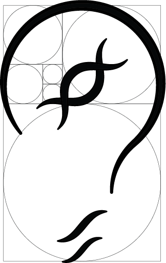
Initial brainstorming sketches found me focusing on the essential shapes of the DNA strand itself and applying it to the containing lightbulb.